


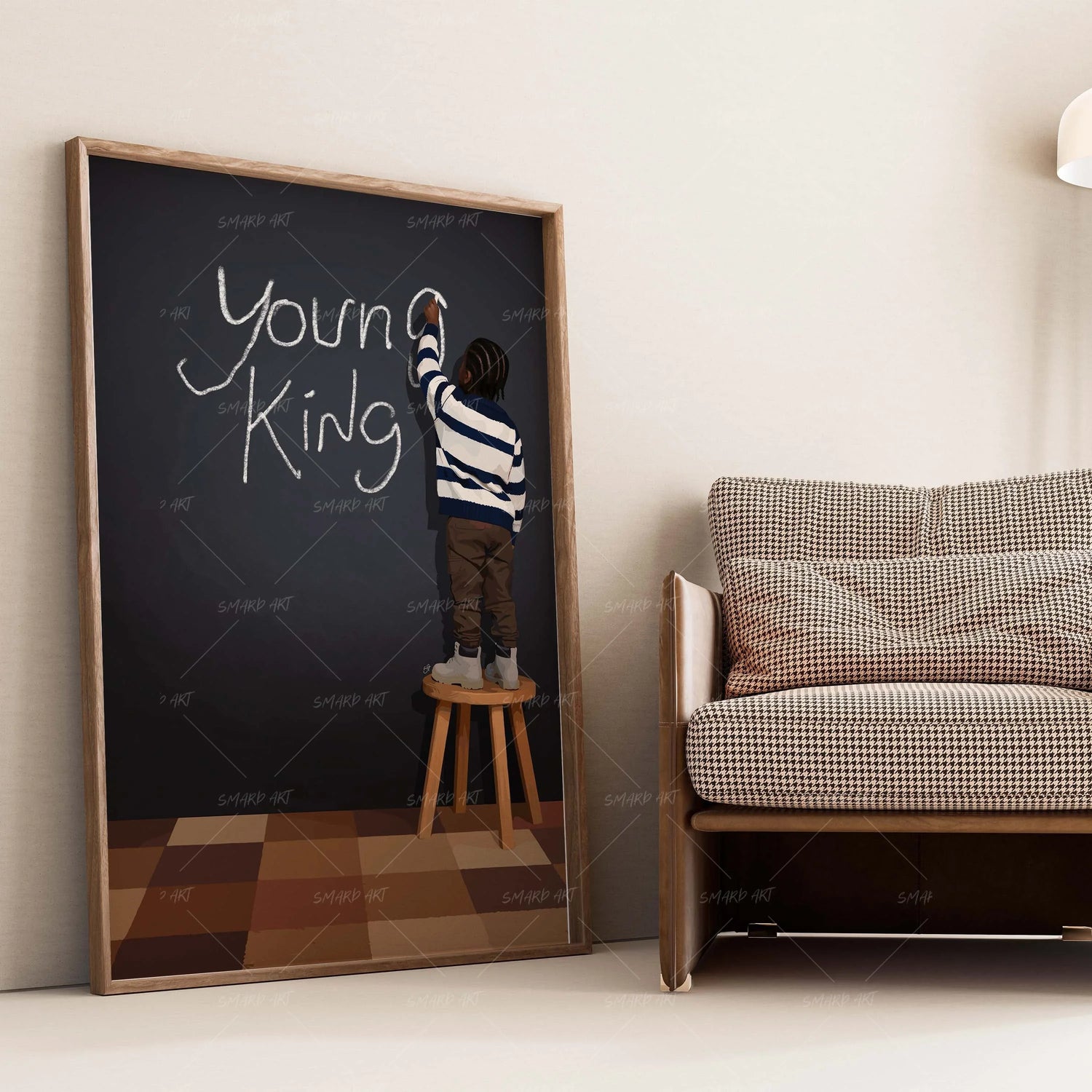
Wall art doesn’t exist in isolation — it lives within a color ecosystem. Walls, furniture, lighting, and décor all influence how art is perceived. The right color scheme can make wall art feel intentional, bold, and elevated. The wrong one can make even great art disappear.
Here are five color schemes that consistently make wall art pop, regardless of room size or style.
1. Neutral Walls + Black Wall Art
This is one of the most timeless and powerful combinations.
Why it works:
- Neutral walls create visual breathing room
- Black wall art provides contrast and structure
- The room feels intentional, not busy
This pairing works exceptionally well in modern, minimalist, and transitional homes. Smard.art’s black wall art collections are designed specifically to shine against neutral backdrops.
2. Earth Tones + Bold Art Accents
Earthy palettes like beige, clay, olive, and warm browns provide a grounded foundation.
Best practices:
- Use black wall art to anchor the room
- Add one or two bold art accents for contrast
- Avoid overly bright walls that compete with the art
This scheme creates warmth without sacrificing sophistication.
3. Monochrome With Contrast
Monochrome doesn’t mean boring — it means controlled.
For example:
-
Grey walls + black wall art
-
White walls + charcoal or ink-toned art
The subtle shifts in tone allow wall art to become the focal point without overwhelming the space.

4. Soft Pastels + Structured Art
Pastels can feel playful or calm, but they need grounding.
This is where black wall art excels:
- It prevents pastels from feeling juvenile
- It adds visual weight and maturity
- It balances softness with intention
Smard.art pieces often serve as the stabilizing element in pastel-heavy interiors.
5. Dark Walls + Minimalist Art
Dark walls can be dramatic when done right.
Tips:
- Use minimalist black wall art with texture or line work
- Ensure proper lighting to avoid flattening the art
- Limit competing décor
This approach creates a gallery-like atmosphere where wall art feels curated and premium.
Common Color Mistakes to Avoid
- Matching art too closely to wall color
- Using too many competing colors
- Ignoring lighting conditions
Art needs contrast to breathe.
How Smard.art Helps Simplify Color Choices
Smard.art curates wall art with balance in mind:
- Designs that complement multiple color palettes
- Black wall art that adapts across interiors
- Pieces that stand out without dominating
This makes choosing art easier, especially for homeowners unsure about color coordination.
Final Thought
The right color scheme doesn’t just support wall art — it elevates it. By understanding contrast, balance, and tone, you can turn your walls into intentional design statements. With Smard.art, wall art doesn’t just fit your space — it transforms it.

Leave a comment
This site is protected by hCaptcha and the hCaptcha Privacy Policy and Terms of Service apply.