


Minimalist homes often struggle with wall art. The challenge is balancing simplicity with personality—too little art feels cold, too much art destroys the clean aesthetic. Here’s how to avoid common mistakes and fix your minimalist walls.
Mistake 1: Choosing Art That Is Too Busy
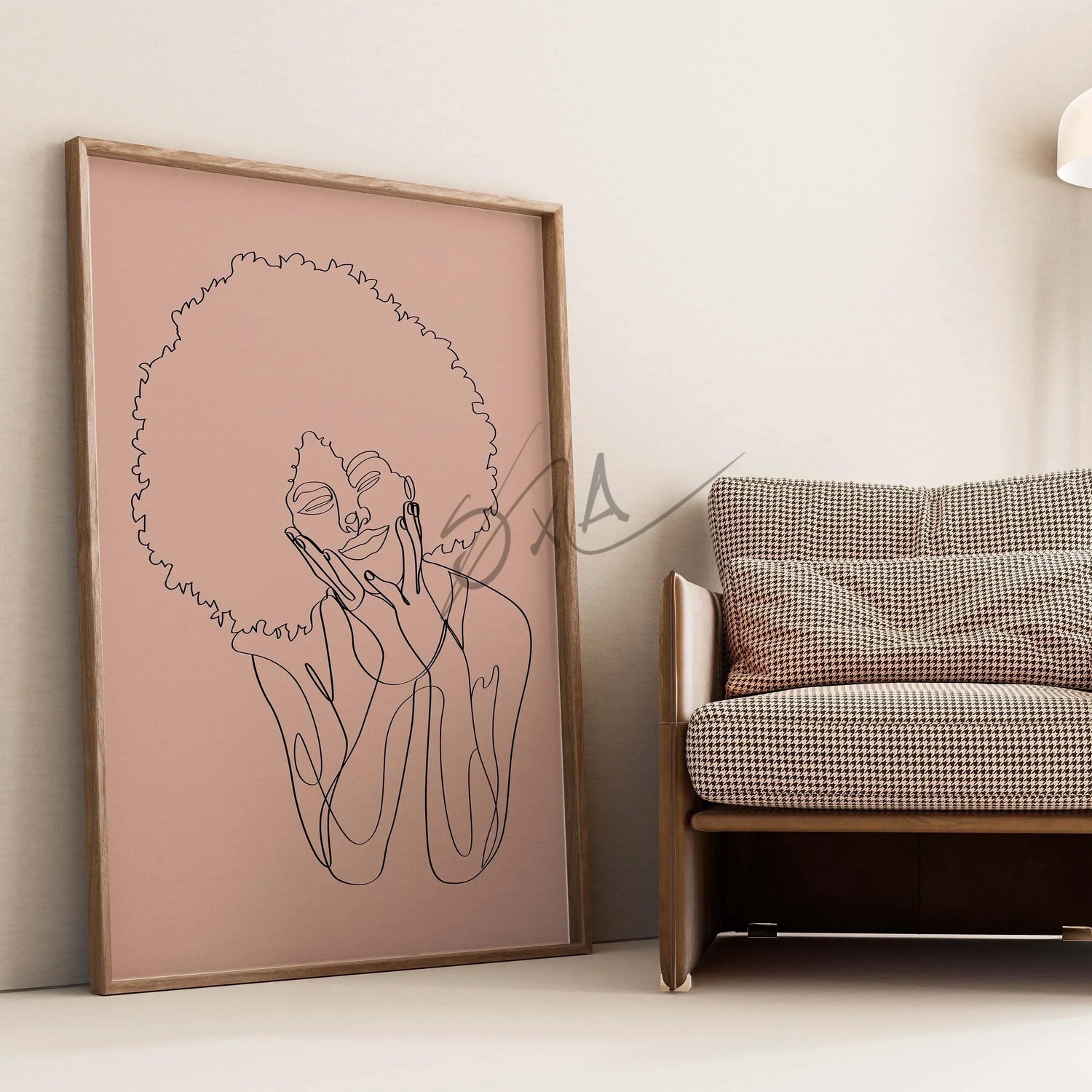
Minimalist spaces thrive on simplicity. Complex, highly detailed artworks can clash with the calm aesthetic. Choose clean, simple designs, muted tones, or abstract shapes to complement your space.
Mistake 2: Hanging Art Without Consideration for Space
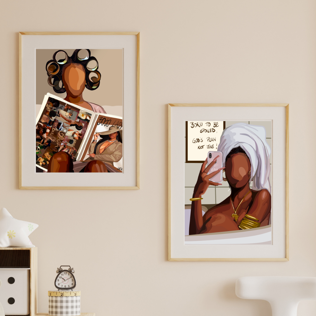
Art in minimalist homes should feel intentional. Ensure placement aligns with furniture and room proportions. Center art above sofas, beds, or consoles, and avoid cluttering walls.
Mistake 3: Ignoring Negative Space
Negative space is a minimalist’s best friend. Allow walls to breathe. One large piece or a small curated gallery works better than overcrowding with multiple small pieces.

Mistake 4: Mismatched Frames or Colors
Consistency is key. Stick to one frame style or color palette for cohesiveness. Neutral frames work best for understated elegance.
Mistake 5: Forgetting Personal Connection
Minimalism doesn’t mean impersonal. Select art that resonates with you—abstract prints, nature-inspired imagery, or geometric shapes can reflect personality subtly.
Final Tips:
-
Use neutral or soft color palettes.
-
Stick to simple, clean lines in artwork.
-
Balance wall space with furniture scale.
-
Choose meaningful pieces for personal connection.
Final Thoughts:
Minimalist wall art should enhance, not overpower. With thoughtful selection, placement, and spacing, even the simplest rooms can feel stylish, intentional, and welcoming.
Leave a comment
This site is protected by hCaptcha and the hCaptcha Privacy Policy and Terms of Service apply.