


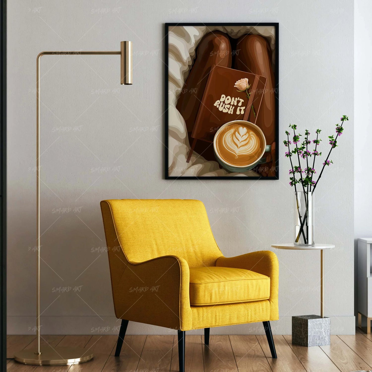
Color is one of the most powerful elements in interior design, and when it comes to wall art, it can completely influence how a room feels. Choosing the right colors for your wall art is not just about matching tones—it is about creating harmony, contrast, and visual balance within your space.
The first step in selecting the right wall art colors is understanding your room’s existing palette. Every room already has a combination of colors from furniture, walls, flooring, and décor. Wall art should either complement these tones or introduce a controlled contrast that enhances the overall look.
A simple approach is to pull colors directly from the room. If your space features neutral furniture with hints of blue or gold accents, choosing artwork that includes similar tones can tie everything together effortlessly. This creates a cohesive environment where no element feels out of place.
For those who prefer a more dynamic look, contrast can be highly effective. Introducing artwork with bold or opposing colors can make the piece stand out and become a focal point. For example, a room with soft neutral tones can benefit from artwork that includes deep blues, rich greens, or warm earthy hues. The key is to ensure that the contrast feels intentional rather than random.
Another helpful concept is the 60-30-10 rule often used in interior design. This guideline suggests that 60 percent of the room should be a dominant color, 30 percent a secondary color, and 10 percent an accent. Wall art can serve as part of that accent, reinforcing the smaller color elements in the room while adding visual interest.
Temperature also plays a role in color selection. Warm colors such as reds, oranges, and yellows create a cozy and inviting atmosphere, while cool colors like blues and greens promote calmness and relaxation. Choosing artwork that aligns with the desired mood of the room helps enhance its overall purpose.
In minimalist spaces, monochromatic artwork can be particularly effective. Using different shades of a single color creates depth while maintaining simplicity. This approach works well in modern interiors where clean and uncluttered designs are preferred.
Patterns and gradients in artwork can also help blend multiple colors seamlessly. Instead of choosing a piece with one dominant color, selecting art that incorporates a range of tones can act as a bridge between different elements in the room.
Lighting should not be overlooked when considering color. Natural and artificial light can alter how colors appear, making them look warmer, cooler, brighter, or more muted. Viewing artwork in the intended space before finalizing a choice can help ensure that the colors work as expected.
Personal preference remains an important factor. While design principles provide guidance, the space should ultimately reflect your taste. Choosing colors that resonate with you ensures that the room feels comfortable and authentic.
Balance is the goal. Whether you choose to match, complement, or contrast, the artwork should feel like a natural extension of the room. When the colors are thoughtfully selected, wall art enhances the entire space rather than competing with it.
A well-coordinated room does not happen by chance—it is the result of intentional decisions. With the right approach to color, wall art becomes a unifying element that brings the entire design together.
Leave a comment
This site is protected by hCaptcha and the hCaptcha Privacy Policy and Terms of Service apply.