


The space above your sofa is one of the most important design areas in your living room. It’s the visual center of the space, and what you place there can either elevate the entire room—or make it feel unfinished.
Choosing the right wall art for this spot isn’t complicated, but it does require a few key decisions.
Why the Area Above Your Sofa Matters
Your sofa naturally anchors your living room. The wall above it is where the eye goes next.
If left empty, the room feels incomplete. If styled poorly, it can feel cluttered or unbalanced.
Done right, this area becomes the focal point of your space.
The Perfect Size Rule
One of the most important guidelines:
Your wall art should be 60–75% the width of your sofa.
For example:
- 84-inch sofa → artwork between 50–63 inches wide
This ensures the art feels connected to the furniture rather than floating above it.
Height Placement Matters
Artwork should sit:
- 6–10 inches above the sofa
Too high, and it disconnects from the space. Too low, and it feels cramped.
Balance is key.
Single Statement Piece vs Multiple Pieces
Option 1: One Large Statement Piece
- Clean and modern
- Easy to style
- Strong visual impact
Option 2: Two or Three Coordinated Pieces
- Adds structure
- Works well in wider spaces
Option 3: Gallery Wall
- More expressive
- Requires careful planning
For most modern homes, a single statement piece is the easiest way to achieve a polished look.

Choosing the Right Style
Your wall art should reflect both your space and your personality.
- Neutral rooms → bold, expressive art
- Colorful rooms → balanced or monochrome art
- Modern interiors → minimalist or abstract styles
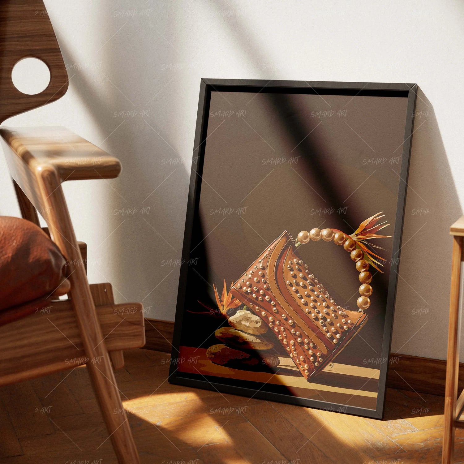
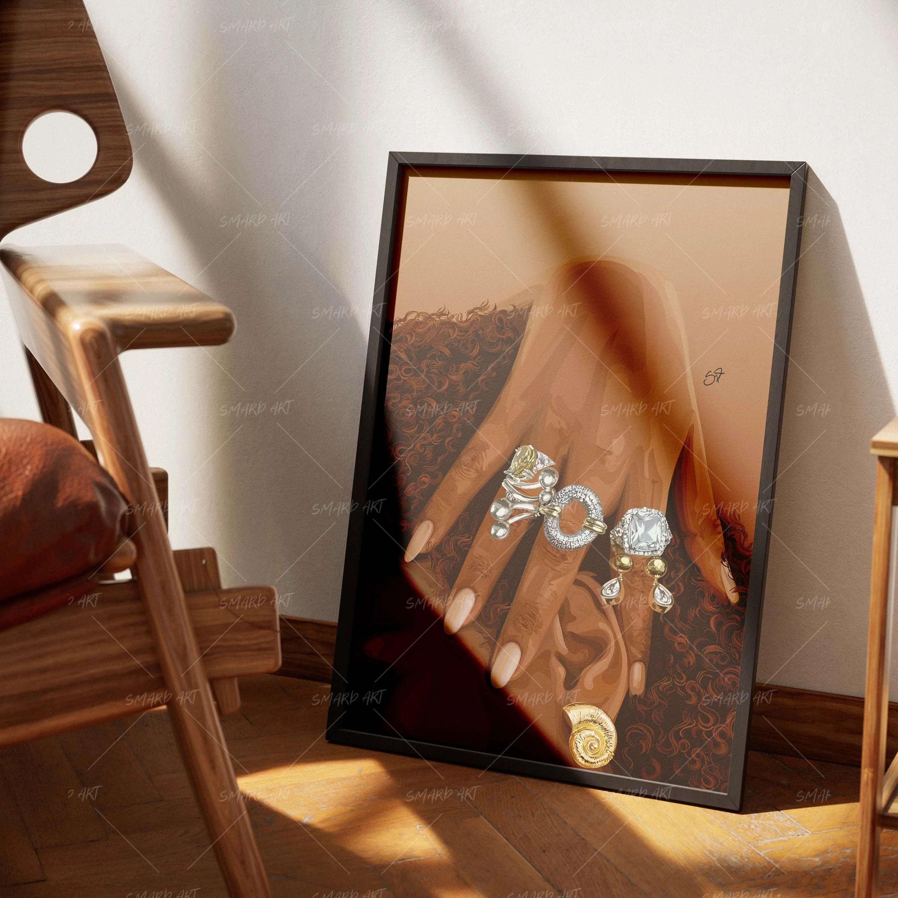
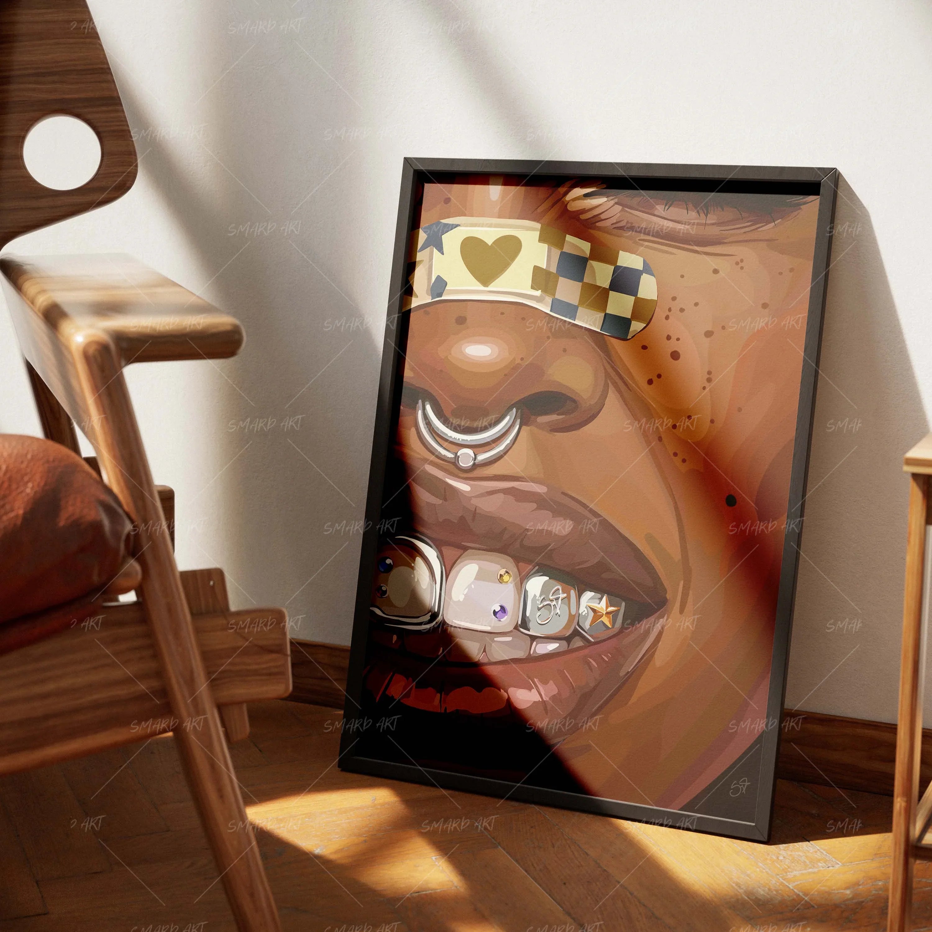
Culturally inspired pieces from Smard Art work especially well here, as they naturally become conversation pieces.
Horizontal vs Vertical Layout
Above a sofa, horizontal artwork usually works best because it mirrors the shape of the furniture.
Vertical pieces can work—but typically in pairs or grouped arrangements.
Color Coordination Tips
Your wall art should:
- Echo tones already in the room
- Add contrast without clashing
It doesn’t need to match perfectly—it just needs to feel intentional.
Common Mistakes to Avoid
- Choosing art that’s too small
- Hanging it too high
- Using too many unrelated pieces
These mistakes can make even a well-designed room feel off.
Enhancing the Look With Lighting
Adding lighting above or around your artwork can:
- Highlight details
- Create depth
- Add a premium feel
Final Thoughts
The space above your sofa isn’t just another wall—it’s the centerpiece of your living room.
When styled correctly, it ties the entire space together and instantly elevates your home.
Leave a comment
This site is protected by hCaptcha and the hCaptcha Privacy Policy and Terms of Service apply.