


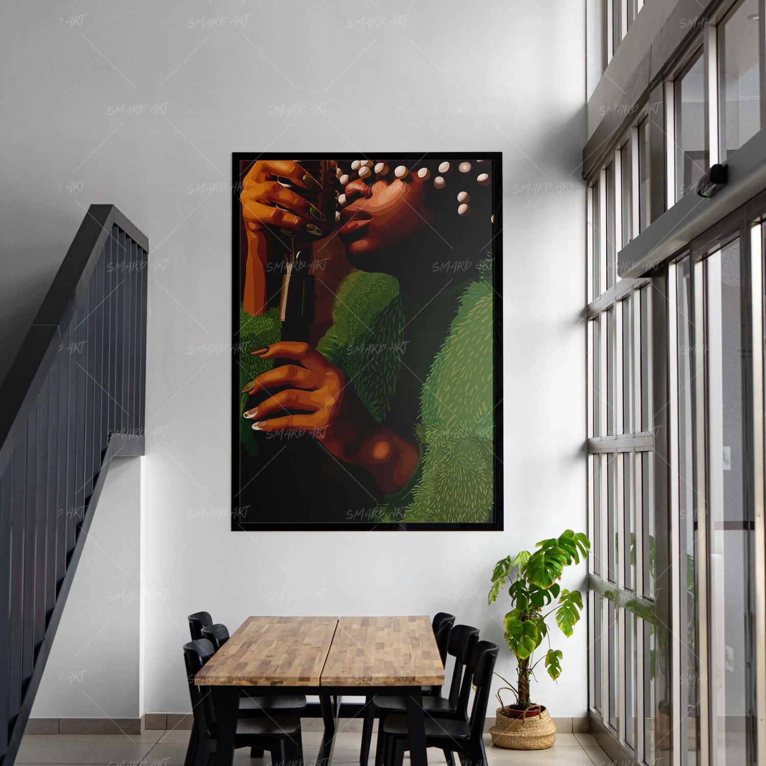
If a room feels small, dark, or closed in, the solution isn’t always knocking down walls—it’s often visual.
Color has a powerful effect on how space is perceived, and wall art plays a major role in shaping that perception.
The right artwork can open up a room, reflect light, and create a sense of airiness without changing the structure at all.
Why Color Matters in Small or Dark Spaces
Colors influence how we interpret space.
Lighter tones reflect light, making a room feel more open. Darker tones absorb light, which can make a space feel more enclosed.
Wall art becomes a strategic tool—it can either expand a room visually or shrink it.
Best Wall Art Colors for a Bigger Feel
1. White and Soft Neutrals
White, cream, beige, and soft greys are the most effective colors for opening up a space.
They:
- Reflect natural and artificial light
- Create a clean, uncluttered look
- Blend seamlessly with most interiors
Neutral-toned wall art works especially well in smaller living rooms and bedrooms.
2. Pastel and Soft Tones
Light blues, soft pinks, and muted greens introduce color without overwhelming the space.
These tones:
- Add personality
- Maintain brightness
- Keep the room feeling airy
They’re perfect for spaces that need both warmth and lightness.
3. Monochrome (Black and White)
While black alone can feel heavy, black and white combinations create balance.
They:
- Add contrast without clutter
- Define the space
- Maintain a clean aesthetic
Smard Art’s monochrome pieces are especially effective in modern interiors where simplicity meets expression.

4. Warm Earth Tones (Used Carefully)
Colors like terracotta, sand, and light brown can add warmth without closing in the room—when used in moderation.
They work best when paired with lighter backgrounds.
Colors to Use Sparingly
- Deep blacks (as dominant tones)
- Heavy reds
- Dark purples
These can make a room feel smaller if overused.
The Role of Background Space
It’s not just about color—it’s about how much of it is used.
Artwork with:
- Open space
- Light backgrounds
- Minimal clutter
Feels more expansive than densely filled designs.
Placement Enhances the Effect
Positioning also impacts how color works.
- Place lighter art where natural light hits
- Use vertical pieces to create height
- Center artwork to maintain balance
Combining Art With Lighting
Lighting amplifies the effect of color.
Warm lighting enhances neutral tones, while cool lighting can highlight blues and whites.
Together, they create a brighter and more inviting environment.
Why Smard Art Works for Bright Spaces
Smard Art pieces often combine expressive subjects with balanced color palettes, allowing you to add personality without overwhelming your space.
Final Thoughts
You don’t need more space—you need smarter visual choices.
The right wall art colors can transform how your room feels, making it brighter, more open, and more inviting.

Leave a comment
This site is protected by hCaptcha and the hCaptcha Privacy Policy and Terms of Service apply.