


Most homes are not ugly—they’re almost stylish. Everything is there: the furniture, the rug, the TV stand, maybe a plant or two. But something still feels incomplete. Empty walls stare back at you. Or worse, you hung a piece of wall art, but somehow the room doesn’t snap together the way Pinterest promised.
That “almost stylish” feeling usually comes down to one thing: art placement.
At Smard.art, we’ve studied rooms, gallery templates, and customer submissions for years, and one pattern keeps repeating—the right art in the wrong place makes a beautiful room look average. But the right placement? It can transform a room instantly.
1. The Center Rule People Ignore
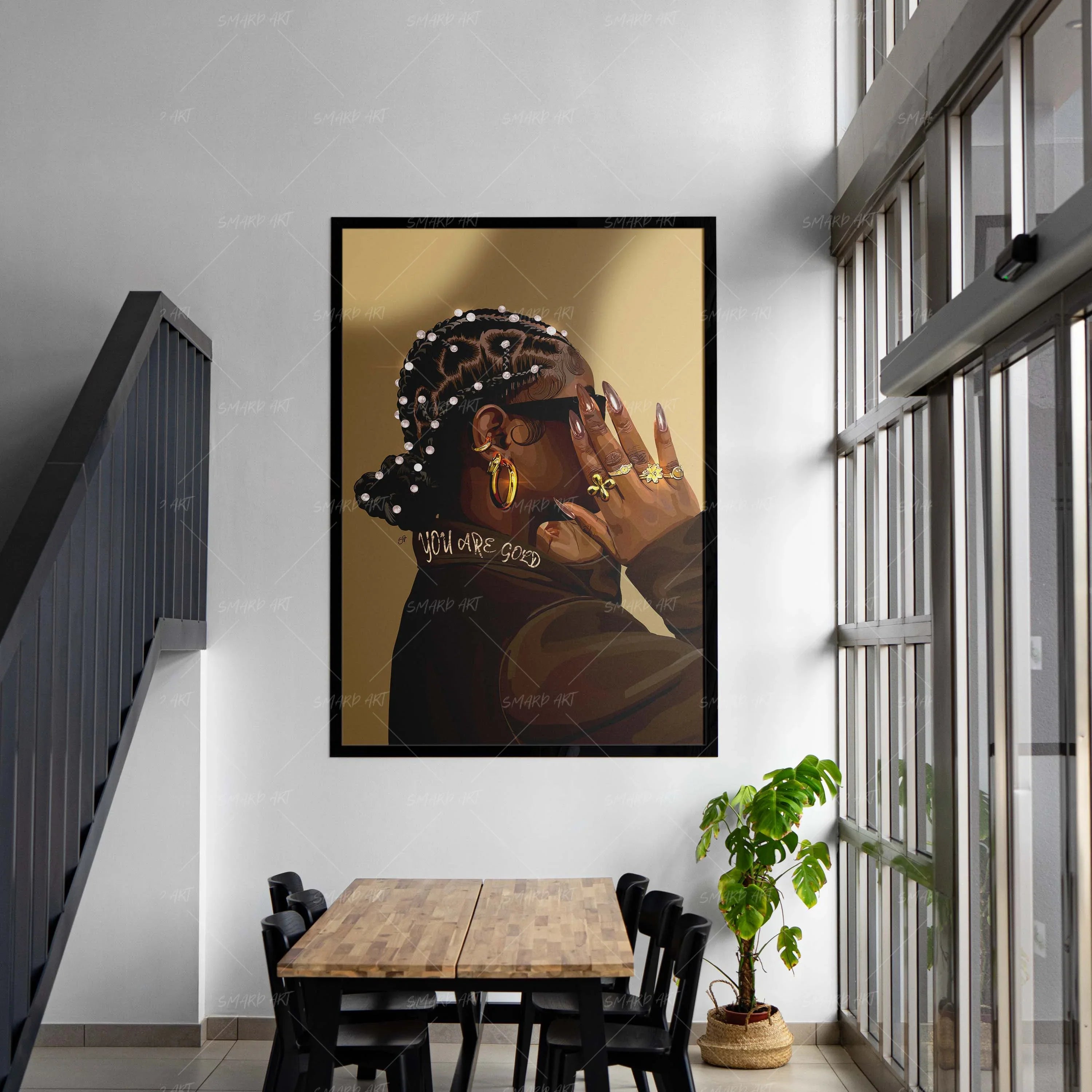
Wall art should sit at 57–60 inches from the floor, which is average eye level. Many people hang their art too high, especially above couches or beds. Lowering it by just a few inches creates immediate visual harmony.
2. The “Two-Thirds” Furniture Rule
When hanging artwork above furniture, the art should be about two-thirds the width of the item below it. Tiny frames floating above wide couches make the room feel disconnected. Large-scale or grouped art creates cohesion.
This is why Smard.art’s collections feature vertically balanced, room-ready pieces—so your wall art naturally fits modern spaces without guesswork.
3. Spacing Changes Everything
If your frames feel “crowded” or “lonely,” it’s usually spacing.
- Gallery walls: 2–3 inches between pieces
- Diptychs/triptychs: 1.5–2 inches
- Large single pieces: Should “breathe” with empty space around them
Spacing literally makes your wall art look more expensive.

4. Oversized Art = Instant Luxury
If you want a hack that always works: choose larger art.
One oversized piece from Smard.art can elevate a living room more than a collection of tiny frames. Large art acts like architectural structure—it fills negative space and gives the room presence.
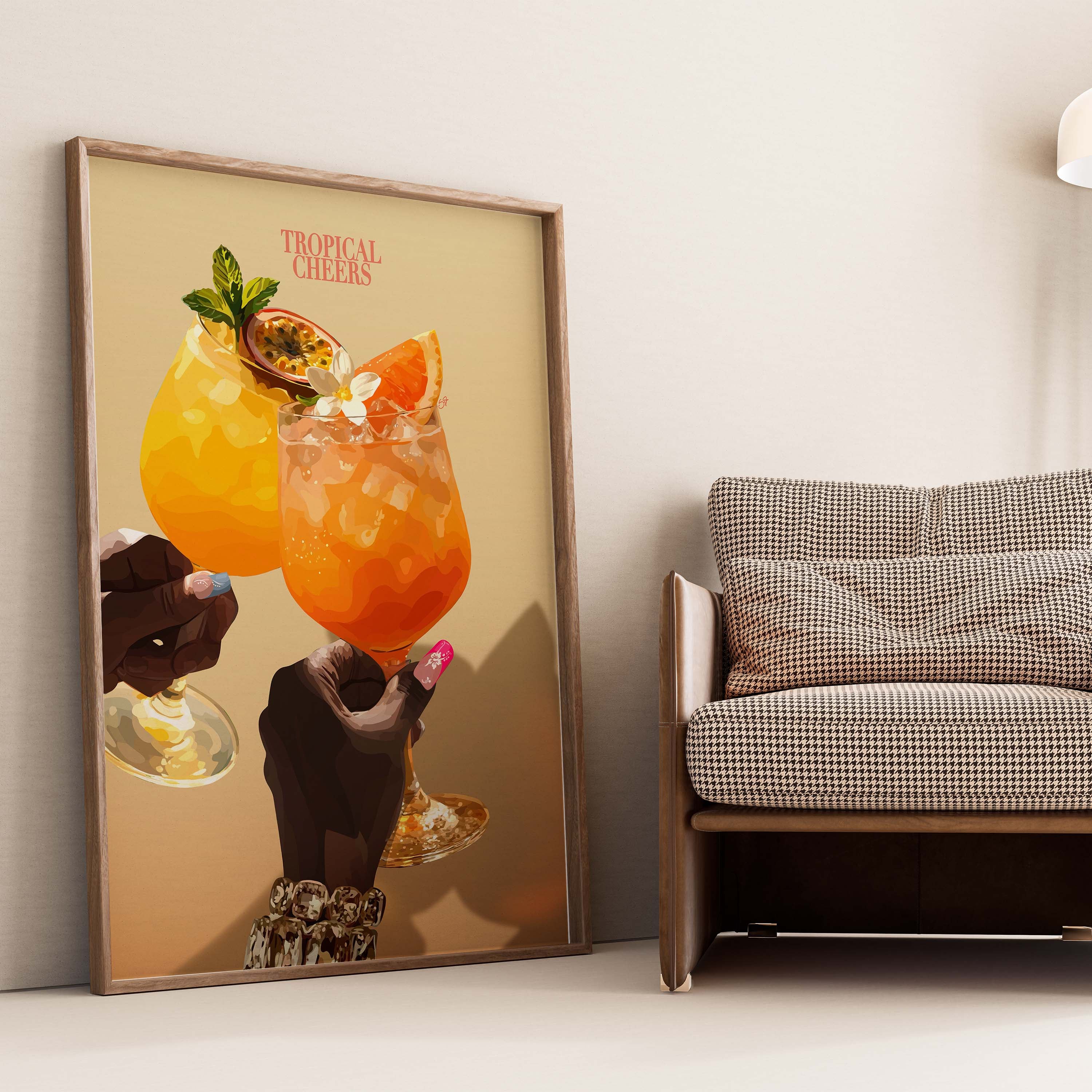
5. Match the Mood, Not the Furniture
A common mistake: choosing wall art that “matches the sofa.”
But great rooms are built on feel, not color-matching.
Ask:
- Do I want this room to feel calm?
- Or bold?
- Cozy?
- Energetic?
Then choose art that fits that emotion. Smard.art categorizes pieces by mood to make this easier.
The Lesson
You don’t always need new furniture. Sometimes you just need to place your art with intention. Your home might already be 90% of the way there—the right wall art placement gives you the final 10% that makes the room look curated and complete.
Leave a comment
This site is protected by hCaptcha and the hCaptcha Privacy Policy and Terms of Service apply.