


Choosing wall art that matches your living room can feel overwhelming. With so many styles, tones, and designs available, it’s easy to pick something beautiful—but completely out of place.
The key is not to match everything perfectly—but to create harmony.
Start With Your Existing Color Palette
Before choosing wall art, look at your space:
- Sofa color
- Rug tones
- Curtains
- Accent pieces
These elements already tell you what your palette is.
Your artwork should complement—not clash with—these tones.
Use the 60-30-10 Rule
Interior designers often use this rule:
- 60% dominant color (walls, furniture)
- 30% secondary color
- 10% accent color
Wall art usually falls into the accent category, meaning it should introduce interest while still fitting within the overall scheme.
Three Easy Ways to Match Wall Art
1. Match Exactly (Safe Option)
Choose artwork that includes the same colors already in your space. This creates a clean, cohesive look.
2. Complement (Balanced Option)
Use colors that sit next to each other on the color wheel—like beige and brown, or blue and green.
3. Contrast (Bold Option)
Introduce a bold pop of color that stands out while still feeling intentional.
This works especially well in neutral homes.
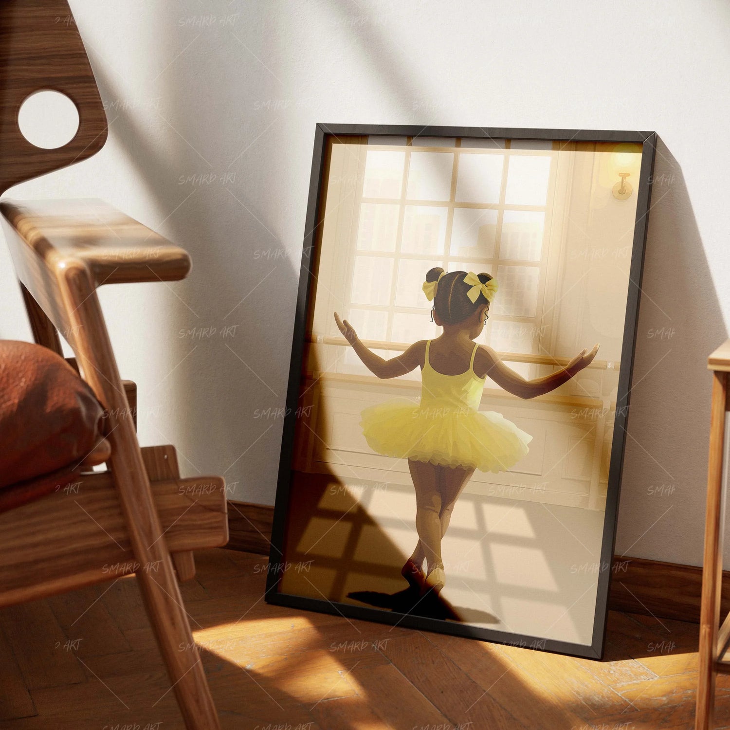
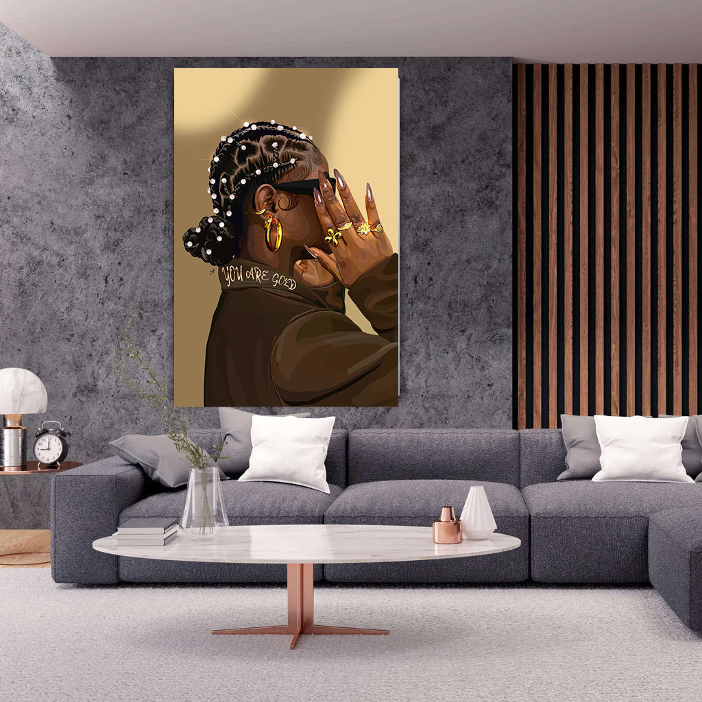
Neutral Rooms Need Personality
If your living room is filled with whites, greys, or earth tones, your wall art becomes the main source of energy.
Cultural, expressive pieces from Smard Art are perfect for this—they instantly add depth without overwhelming the space.
Don’t Forget About Mood
Colors affect how a room feels.
- Warm tones (reds, oranges): energetic and inviting
- Cool tones (blues, greens): calm and relaxing
- Neutral tones: clean and minimal
Choose art based on the mood you want your space to create.
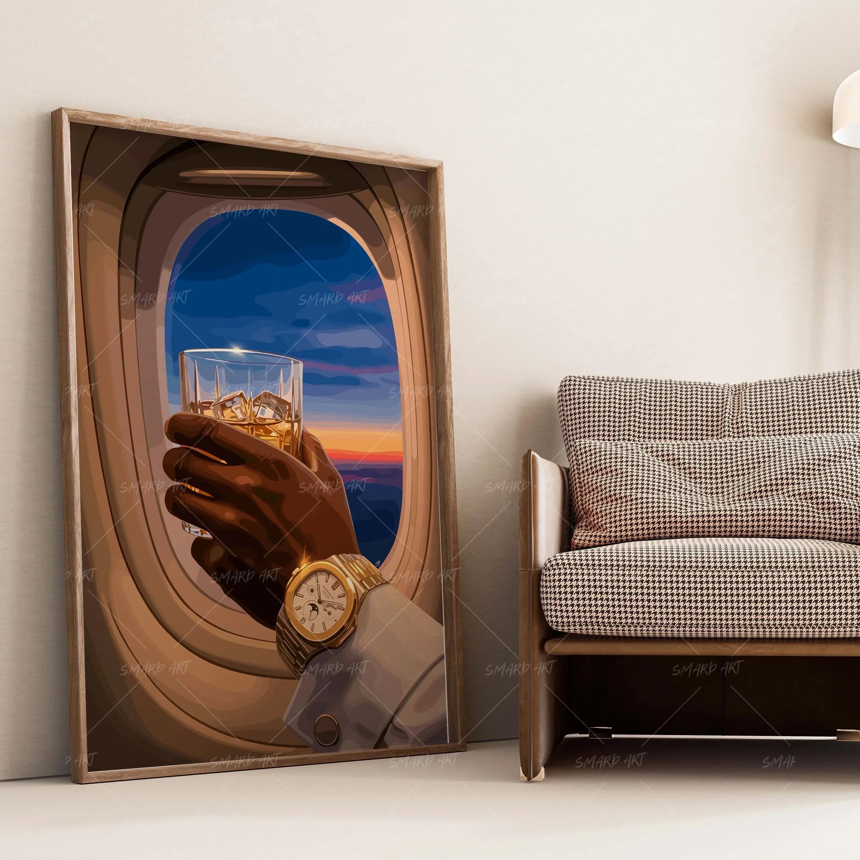
Frame and Background Matter Too
It’s not just the artwork itself—the framing and background also impact how well it fits your room.
- Black frames → modern and bold
- White frames → clean and minimal
- Wood tones → warm and natural
Final Thoughts
Matching wall art isn’t about perfection—it’s about connection.
When your art reflects your space, your personality, and your story, everything naturally comes together.
Leave a comment
This site is protected by hCaptcha and the hCaptcha Privacy Policy and Terms of Service apply.