


The right color palette can make your Black art pop while keeping your space cohesive. Start with the dominant hues in your chosen piece and let those tones inspire your room’s palette.
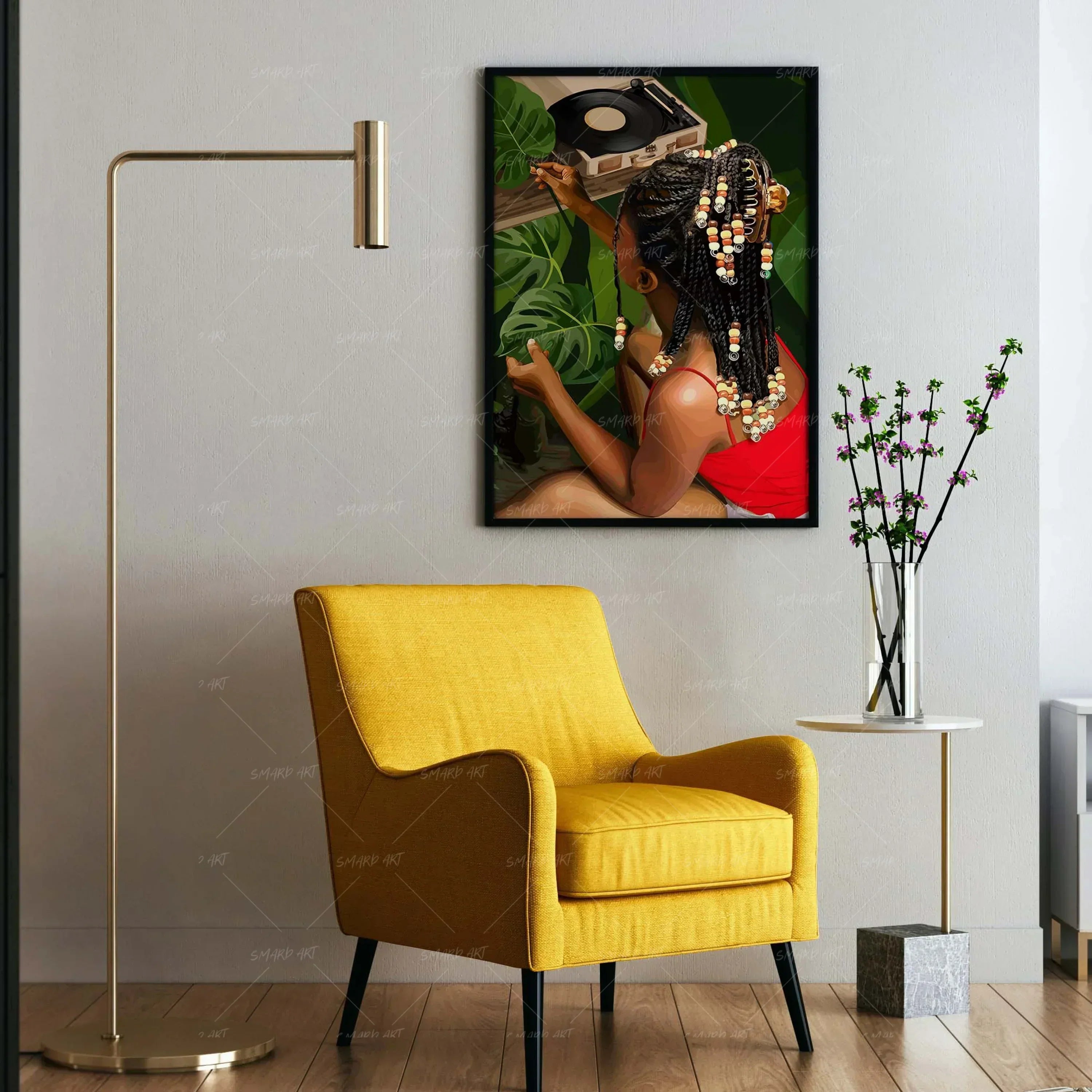
If your art includes warm earthy tones—like brown, mustard, terracotta, and olive—pair them with natural woods, woven textures, and matte finishes for a grounded, soulful look.
For modern Black photography or minimalist line art, sleek black, white, and gray tones create a timeless, elegant backdrop.
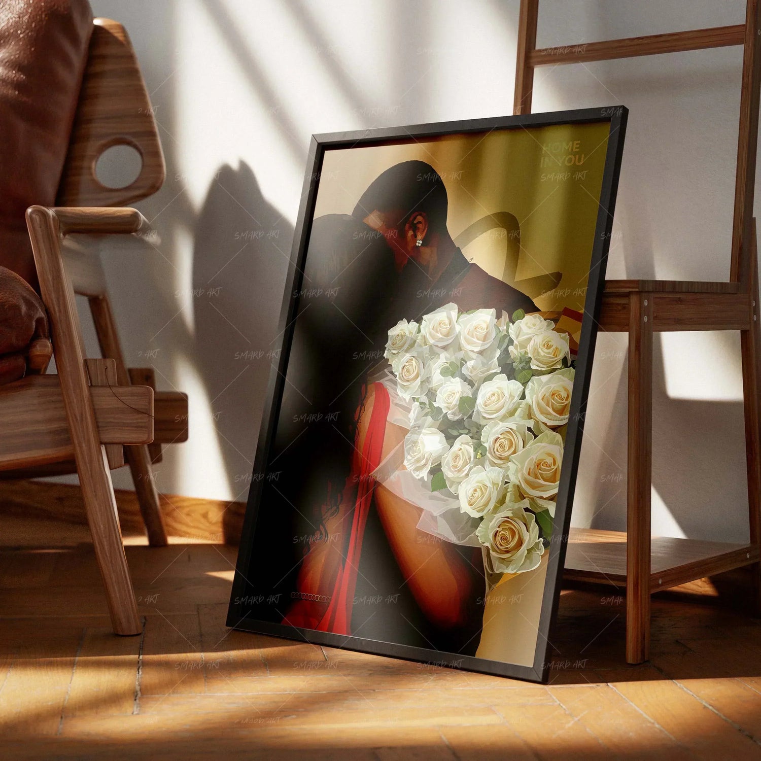
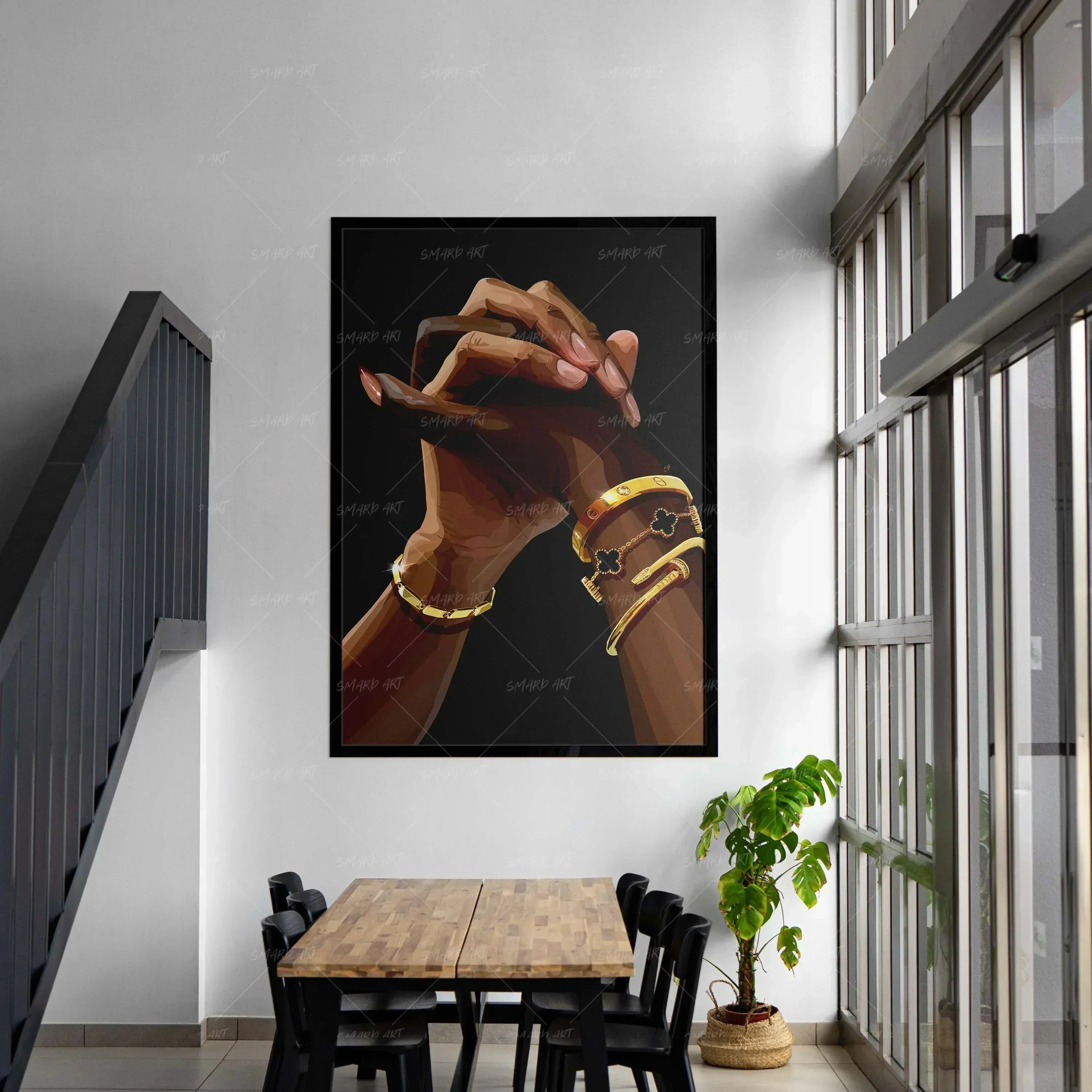
Want something bold and regal? Accent with metallic gold, deep emerald, or royal blue to highlight the richness often found in African-inspired works.

Lighting also plays a role: soft warm lights enhance warm palettes, while cool LED lighting enhances contrast in monochrome art.
SmardArt curates collections with interior harmony in mind—each artwork designed to complement modern homes while keeping the cultural narrative front and center.
Leave a comment
This site is protected by hCaptcha and the hCaptcha Privacy Policy and Terms of Service apply.