


Wall art can dramatically enhance the look of a room, but improper placement can have the opposite effect. Many homeowners unknowingly make simple mistakes that disrupt the balance and harmony of their interior design.
Fortunately, these mistakes are easy to fix once you understand the basic principles of art placement.
Here are seven of the most common mistakes people make when hanging wall art—and how to avoid them.
1. Hanging Artwork Too High
This is the most common mistake in interior design.
When artwork is placed too high on the wall, it feels disconnected from the rest of the room. Instead of appearing integrated with the furniture, it looks like it is floating above the space.
Designers recommend hanging artwork so that the center sits roughly 57 to 60 inches from the floor, which corresponds to average eye level.
This height ensures the artwork feels natural and comfortable to view.
2. Choosing Art That Is Too Small
Small artwork on large walls often looks lost and ineffective.
When selecting art, scale matters. A tiny frame above a large sofa creates visual imbalance.
To maintain proportion, artwork above furniture should generally be about two-thirds the width of the furniture below it.
Larger pieces or grouped artworks create a stronger visual impact.
3. Ignoring Furniture Placement
Artwork should relate to the furniture around it.
When art is hung too far above furniture such as sofas, beds, or consoles, it breaks the visual connection between the two elements.
Ideally, the bottom of the artwork should sit 6–8 inches above the furniture.
This keeps the artwork visually anchored to the space.

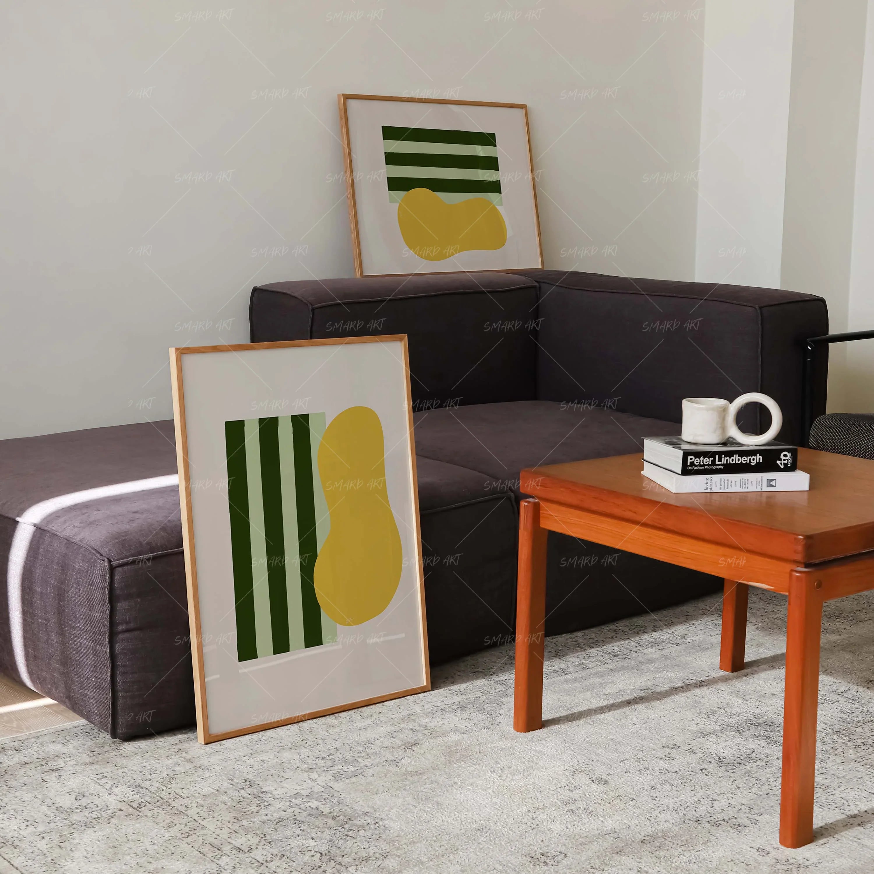
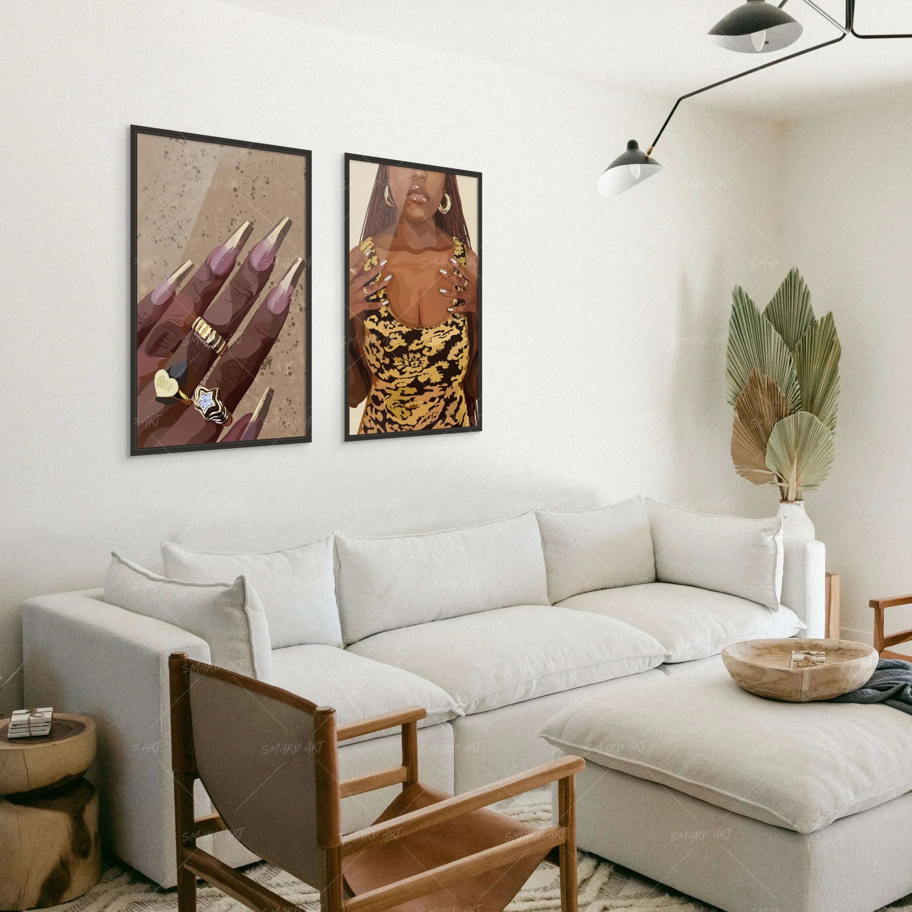
4. Uneven Spacing Between Frames
Gallery walls can look messy if frames are spaced unevenly.
Consistent spacing—typically around 2 to 3 inches between frames—creates a polished and professional appearance.
Even spacing helps unify multiple pieces into a cohesive display.
5. Overcrowding the Wall
Too many artworks crammed together can overwhelm a room.
Negative space is essential for allowing each piece to stand out. Instead of filling every inch of the wall, leave space around artworks to maintain balance.
Minimalism often creates a more sophisticated visual effect.
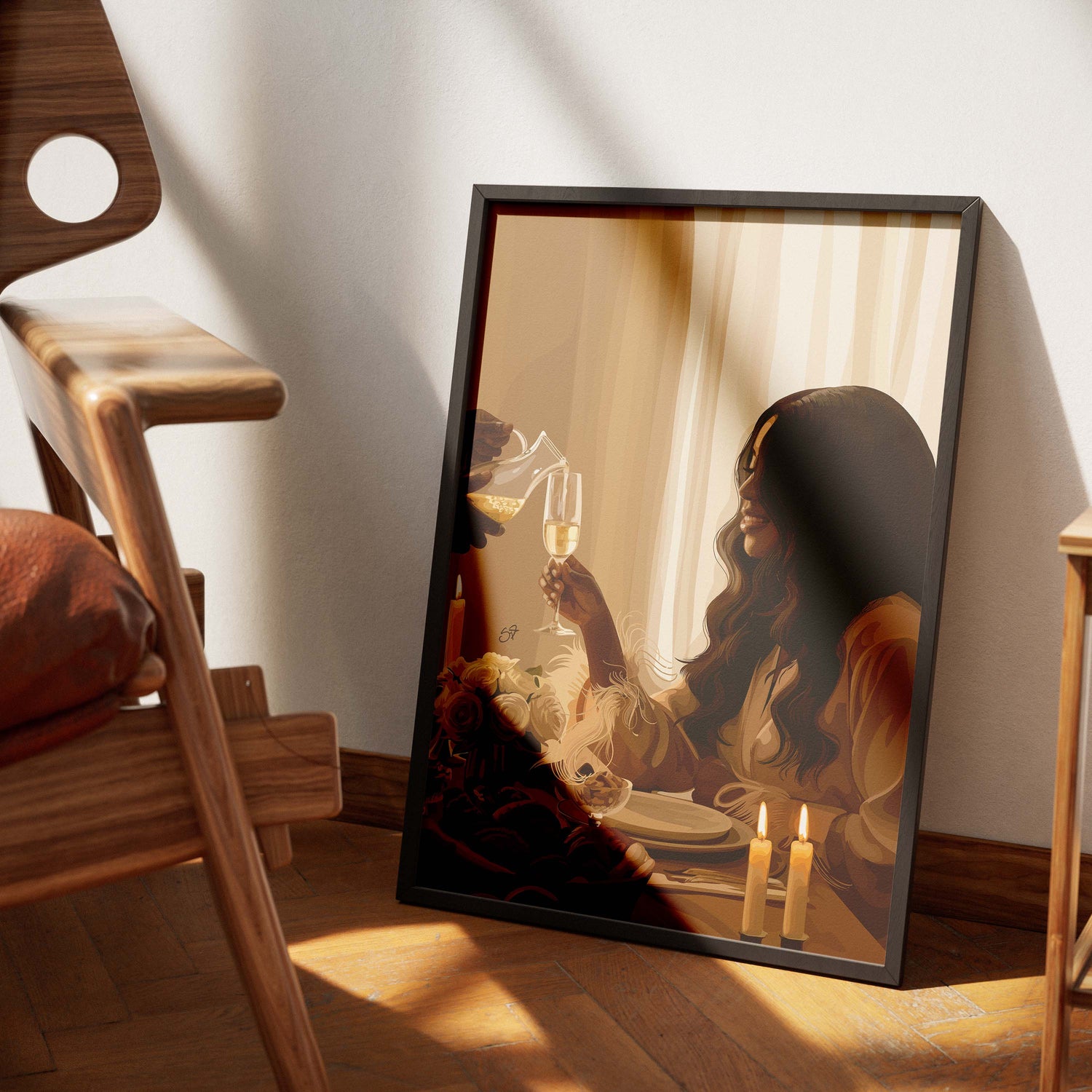
6. Ignoring the Room’s Color Palette
Artwork should complement the room’s existing color scheme.
When colors clash dramatically with furniture or décor, the room can feel disjointed.
Choosing artwork that includes similar tones to the room’s accents helps create visual harmony.
For example, colors found in cushions, rugs, or curtains can be echoed within the artwork.
7. Not Planning the Layout First
Many people start hammering nails before planning the arrangement.
This can lead to unnecessary holes and poorly aligned artwork.
Interior designers often recommend laying out the arrangement on the floor first or using paper templates taped to the wall.
Planning the layout ensures a balanced and intentional design.
Final Thoughts
Hanging wall art may seem simple, but small details can make a big difference. Avoiding common mistakes such as incorrect height, poor spacing, and mismatched scale helps create a more polished and professional look.
When artwork is properly selected and placed, it enhances the room’s design while reflecting personal style.
Thoughtful art placement transforms walls from empty surfaces into powerful design elements.
Leave a comment
This site is protected by hCaptcha and the hCaptcha Privacy Policy and Terms of Service apply.