


Wall art has the ability to transform a space, but improper placement can reduce its impact. Even beautiful artwork may look awkward or out of place if it is not hung correctly.
Many homeowners unintentionally make simple mistakes that affect the balance and appearance of a room. Fortunately, these mistakes are easy to avoid once you understand a few basic design principles.
Here are ten common interior design mistakes to watch out for when hanging wall art.
Hanging Artwork Too High
One of the most common mistakes is placing artwork too high on the wall.
When art is hung near the ceiling, it feels disconnected from the rest of the room. Interior designers generally recommend positioning artwork so that its center sits about 57 to 60 inches from the floor, which corresponds to average eye level.
This placement ensures that the artwork is comfortable to view and feels naturally integrated into the space.
Choosing Artwork That Is Too Small
Small artwork on a large wall often looks insignificant.
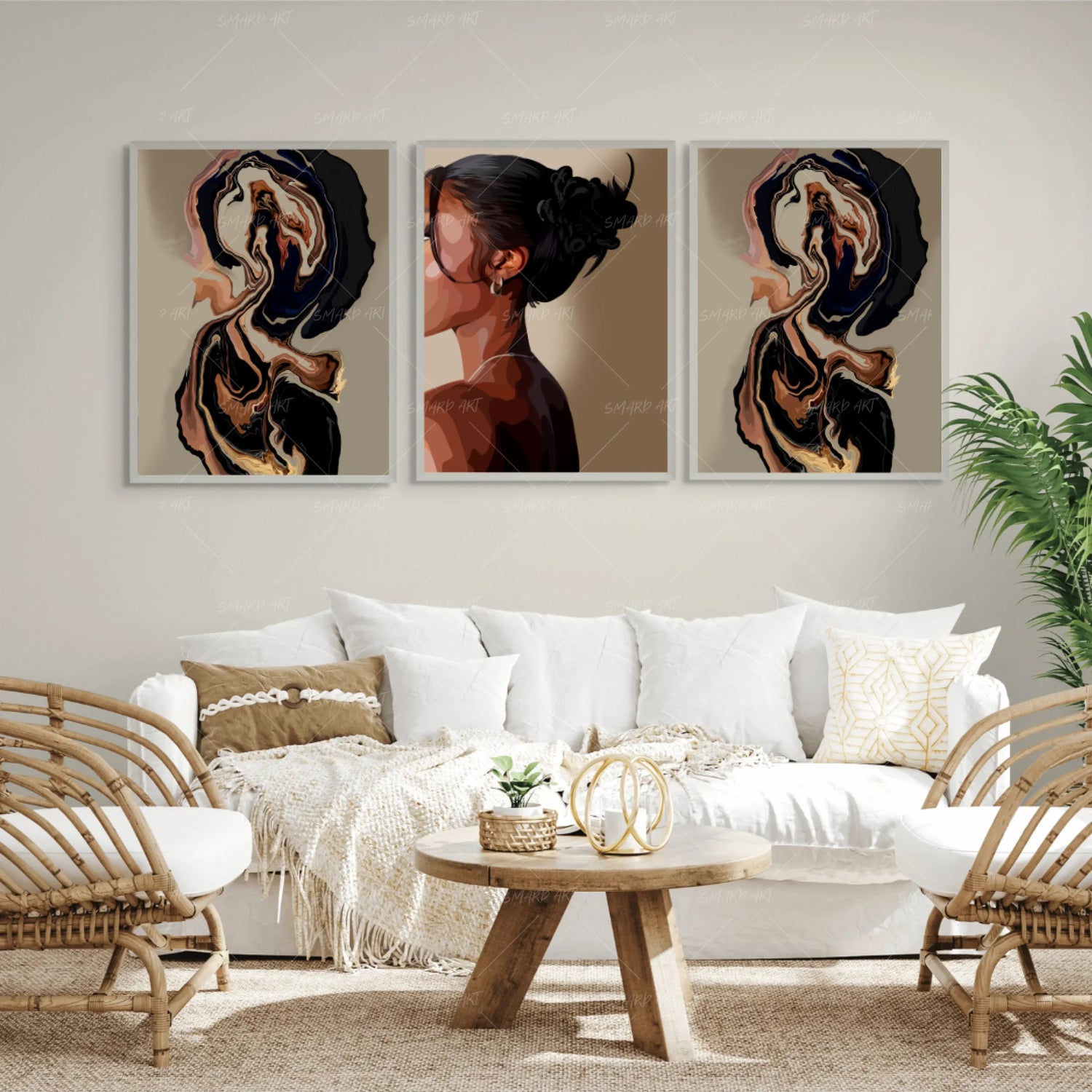
If the wall space is large, the artwork should have enough presence to fill the area. Larger pieces or multi-panel artwork can help create the necessary visual impact.
Another option is to combine several smaller pieces into a gallery wall arrangement.
Scale should always match the size of the wall.
Ignoring Furniture Proportions
Artwork should relate to the furniture around it.
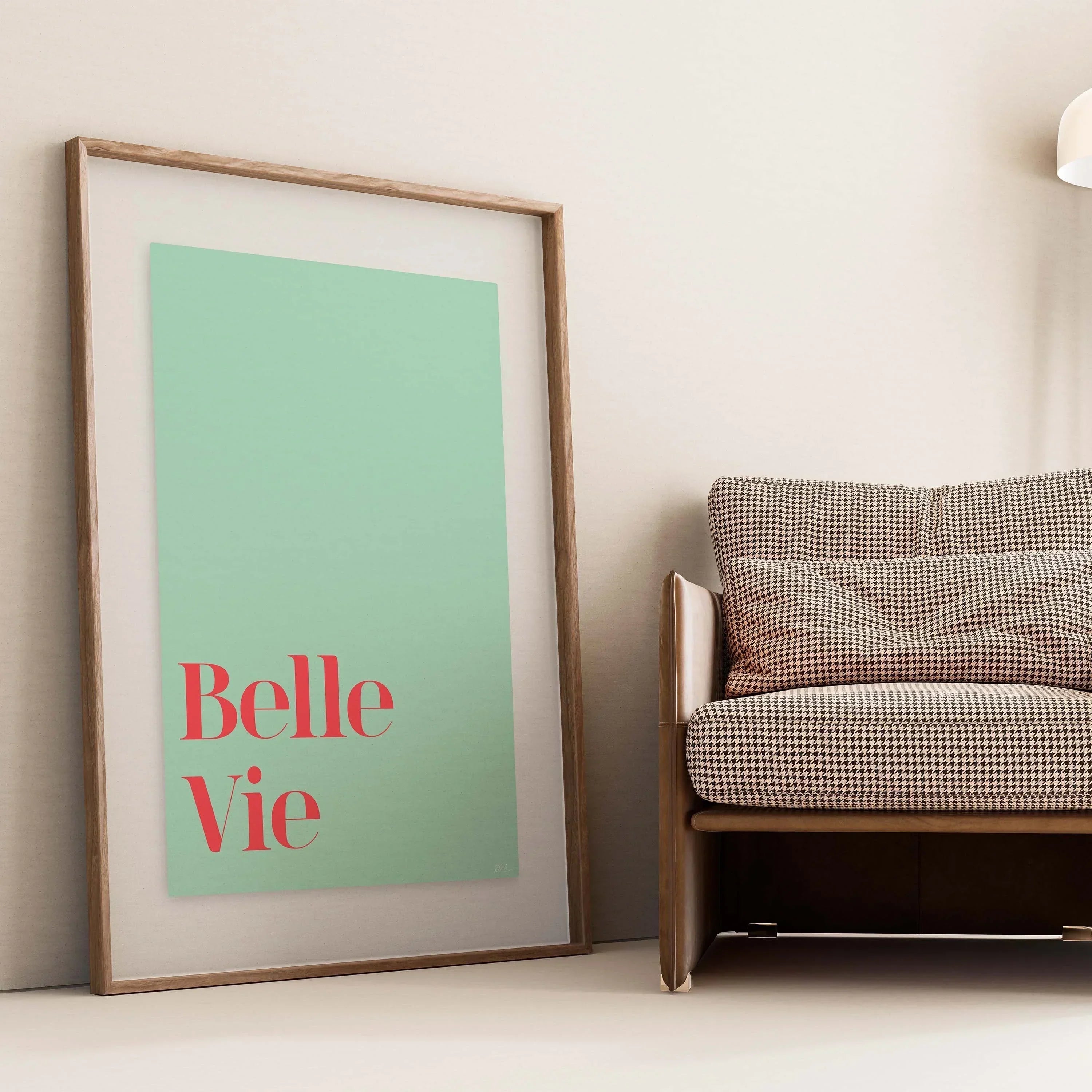
For example, when hanging art above a sofa or bed, the artwork should typically be about two-thirds the width of the furniture below it. This proportion creates visual harmony between the art and the furniture.
Ignoring this relationship can make the room feel unbalanced.
Poor Spacing Between Pieces
Gallery walls and multi-piece displays require consistent spacing.
Frames that are too close together may appear cluttered, while pieces that are too far apart may look disconnected. Designers often recommend leaving two to three inches between frames to maintain balance.
Consistent spacing helps unify the display.
Using Too Many Styles at Once
Mixing styles can create an interesting display, but too many unrelated elements may feel chaotic.
For example, combining modern abstract art with traditional paintings and bold typography in one small space may disrupt visual harmony.
Choosing a general theme or color palette helps maintain cohesion.

Not Considering the Room’s Color Scheme
Artwork should complement the colors already present in the room.
Ignoring the existing palette can make the artwork appear out of place. Selecting art that includes colors found in furniture, rugs, or décor helps unify the overall design.
This small detail can dramatically improve the look of a room.
Forgetting About Lighting
Lighting plays a crucial role in how artwork is perceived.
Poor lighting can hide details and reduce the impact of a piece. Proper lighting, whether natural or artificial, highlights colors and textures.
Picture lights or nearby lamps can enhance the presentation of wall art.
Overcrowding the Wall
Too many pieces on a single wall can create visual clutter.
While gallery walls can look beautiful, they require careful planning to avoid overwhelming the space. Sometimes one large statement piece can be more effective than several smaller artworks.
Balance is essential in interior design.
Not Planning the Layout First
Another common mistake is hanging artwork without planning the arrangement.
Testing layouts on the floor or using paper templates on the wall can help visualize the final design before committing to nails or hooks.
Planning ensures the display looks intentional and balanced.
Ignoring Personal Meaning
Finally, some people choose artwork purely based on trends.
While trends can offer inspiration, the best artwork is the kind that holds personal meaning. Pieces that reflect identity, culture, or personal experiences create stronger emotional connections within a space.
Meaningful art often becomes the most valued part of home décor.
Final Thoughts
Hanging wall art may seem simple, but small mistakes can significantly affect how a room looks and feels.
By paying attention to placement, scale, spacing, and color coordination, homeowners can avoid common design pitfalls and create spaces that feel balanced and visually engaging.
When displayed thoughtfully, wall art becomes a powerful design element that enhances the character and atmosphere of a home.
Leave a comment
This site is protected by hCaptcha and the hCaptcha Privacy Policy and Terms of Service apply.